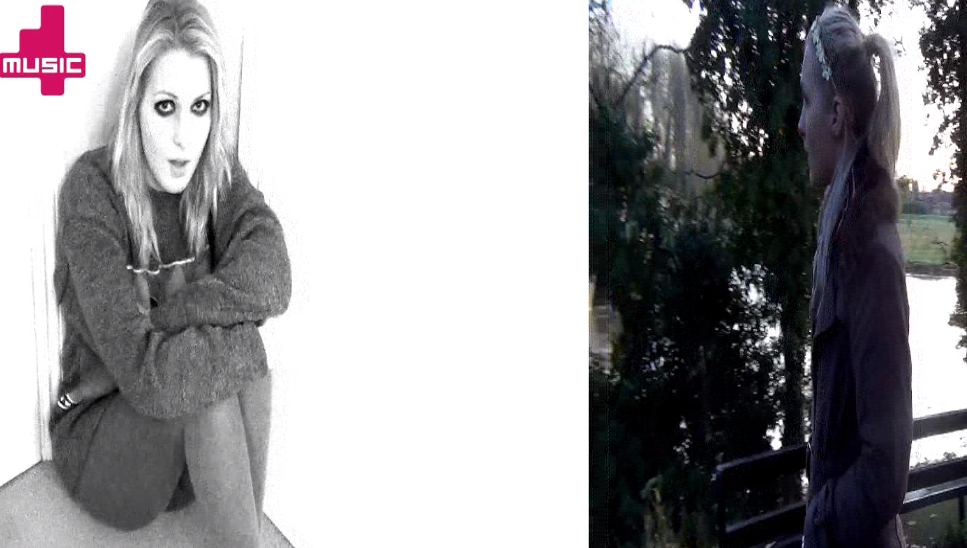
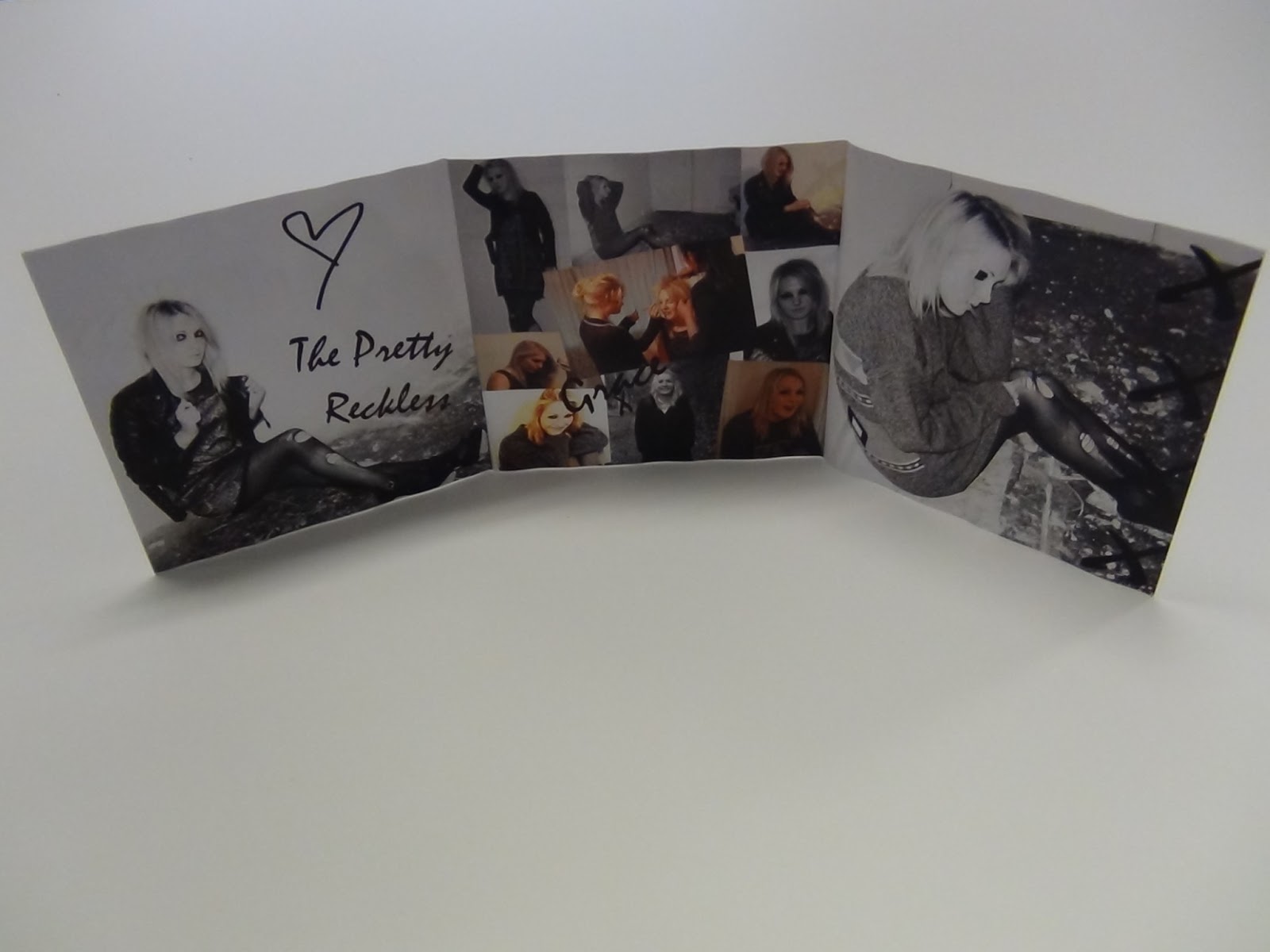
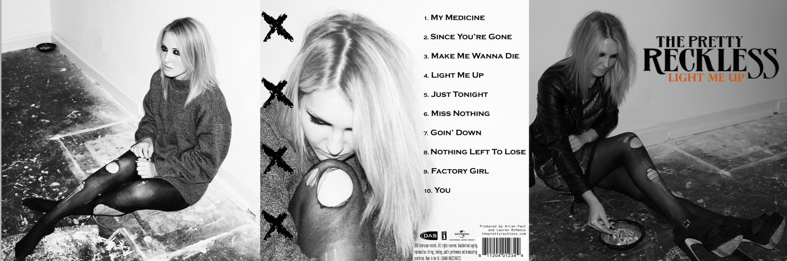
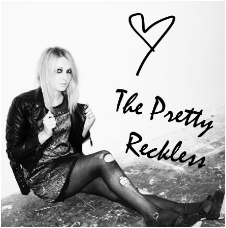
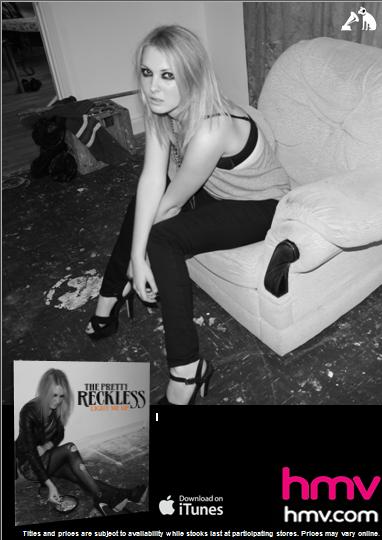
The image above is the outside of the album cover as well as one side of the inside cover. We have stayed with the theme of black and white as we believed it looked very effective and went well with the grunge theme. Something we were keen to stay by. The image on the right is an image that will be in the opening of the case and we have altered the brightness and contrast to be the same as the others as we wanted to stay with the theme.
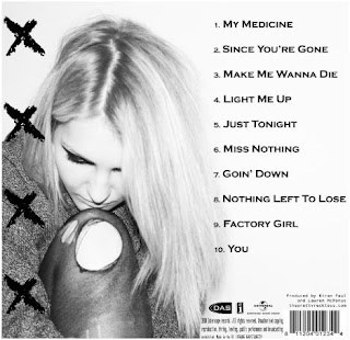
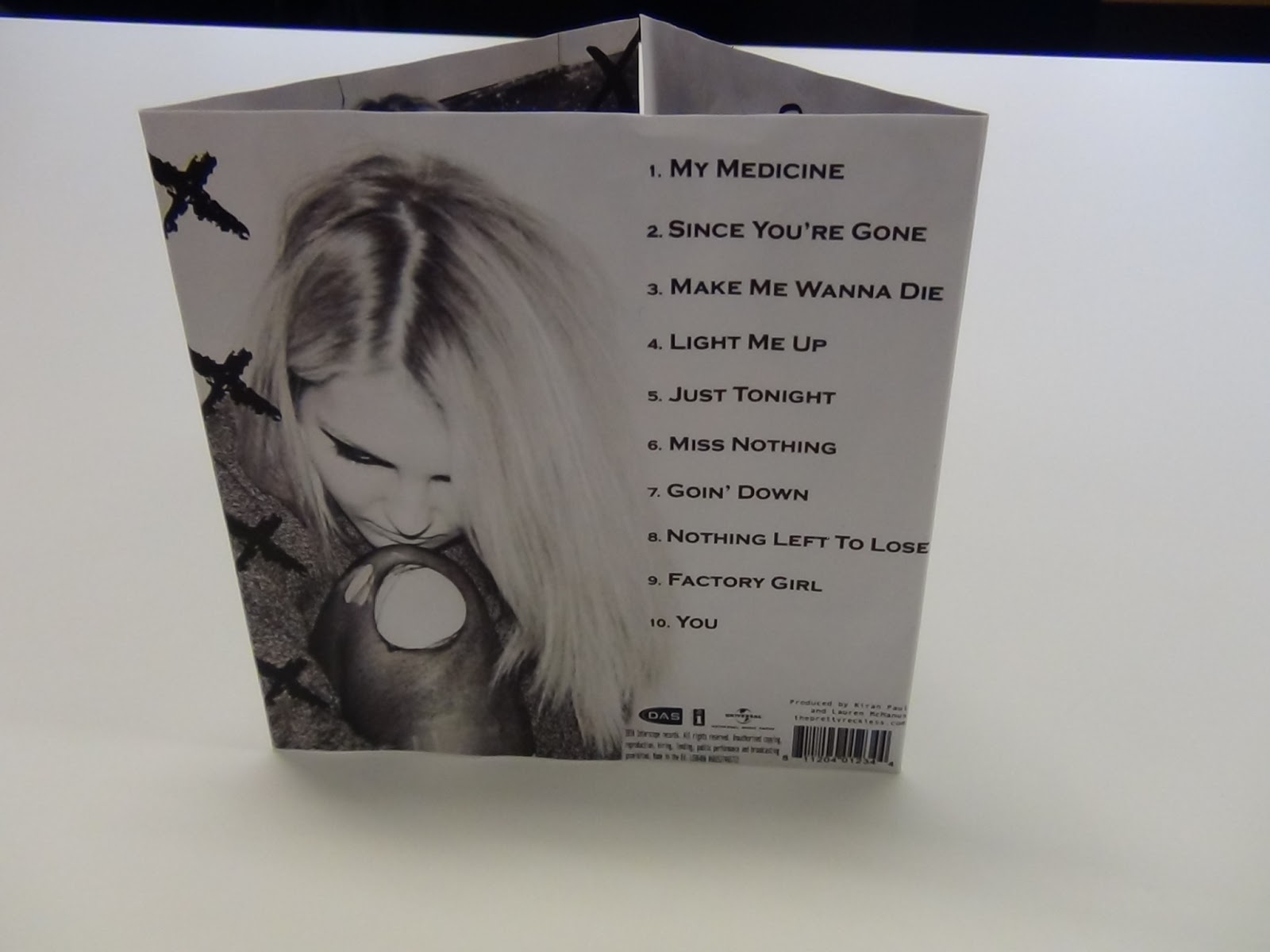
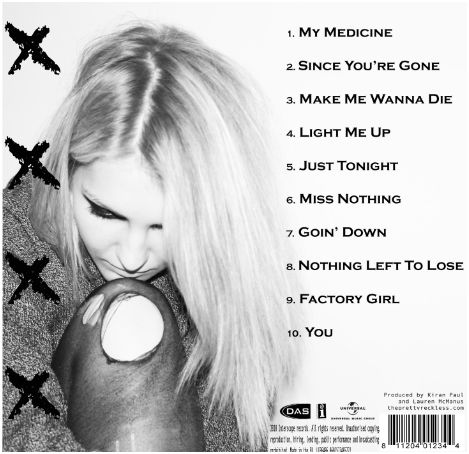
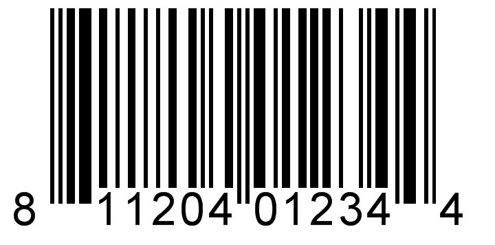
The middle image is the back cover. The barcode is located in the bottom right corner as followed by the codes and conventions and the record label and other label icons are displayed above the text which is found on every album cover. The song titles are displayed on the right and the last few go on top of the main image however it looks realistic and normal for an album cover to do. The four x's have been used on every album of The Pretty Reckless so to follow the same theme we decided to used them on the back cover. We did this in a chalk font to look bold against the back cover.

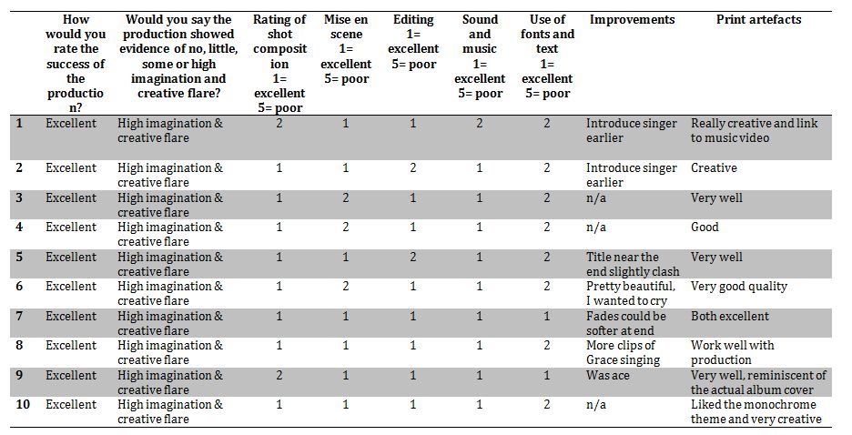
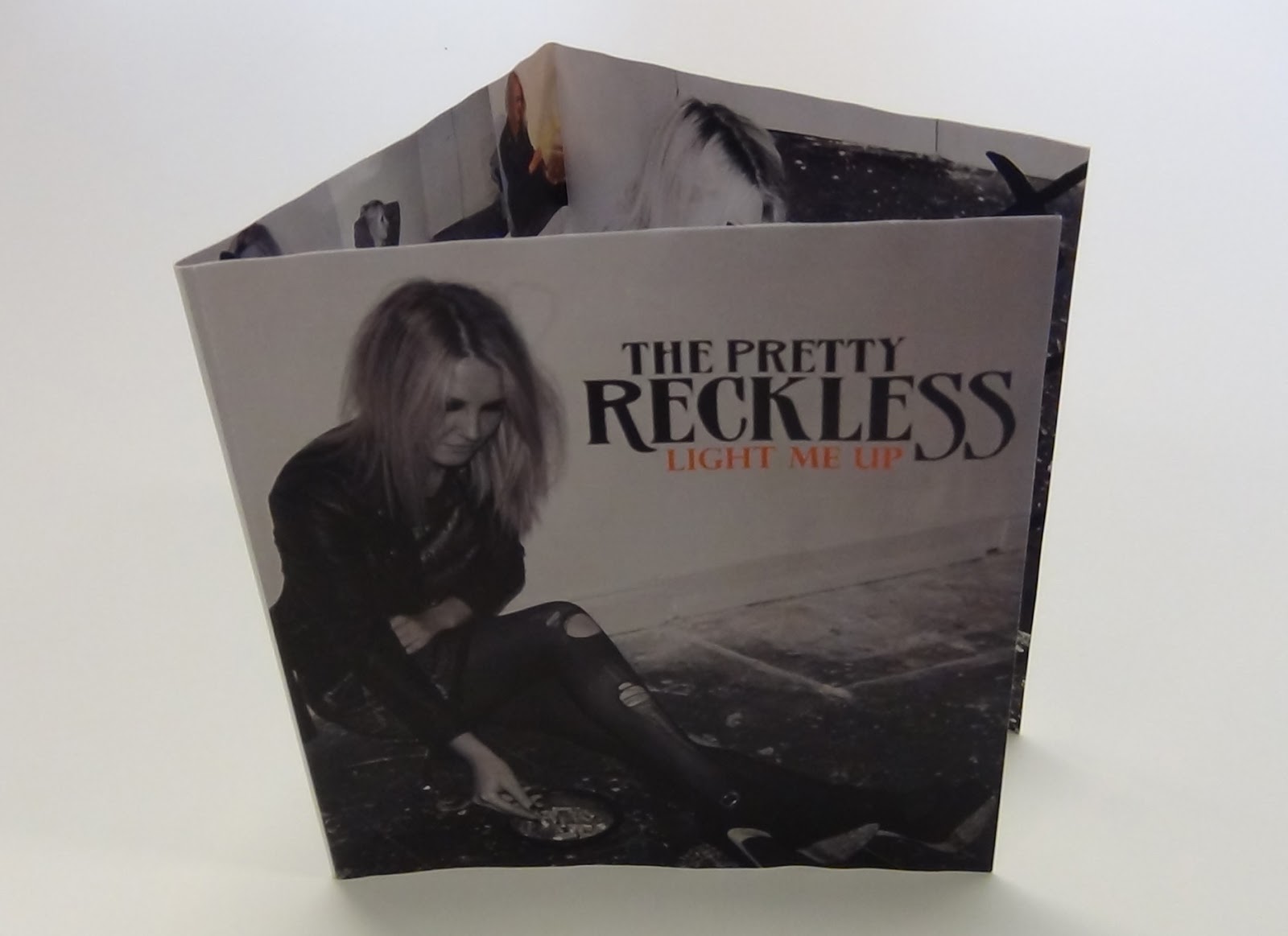
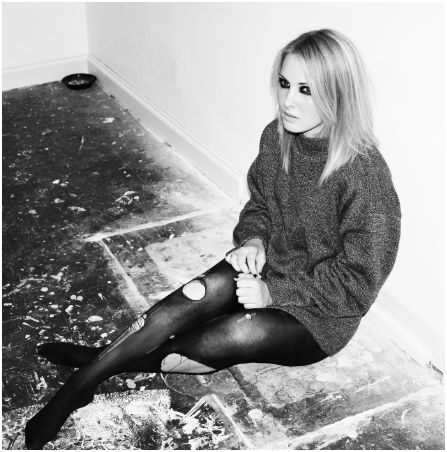
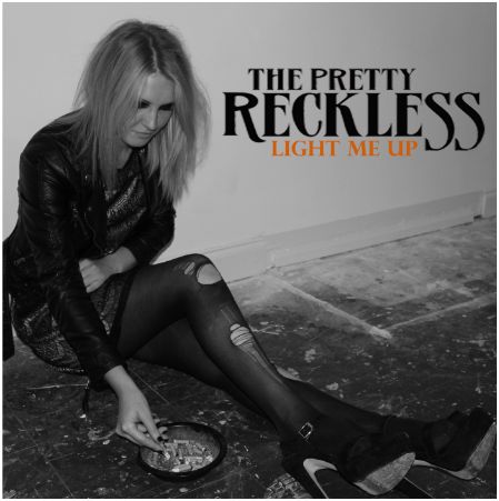
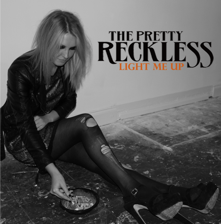
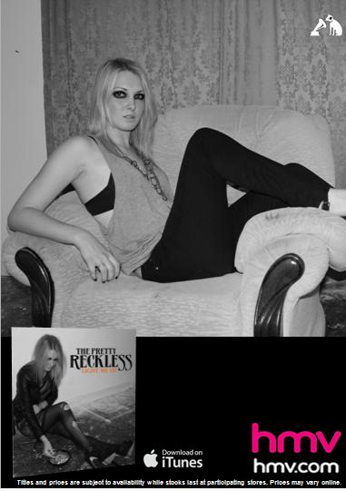
This image is the front cover. We kept it simple as we wanted the image to be the main focus. Most front covers have a title and just the image as it needs to appeal to the customers. We did not brainstorm front covers ideas because as soon as we took this photo we knew we wanted this as the front cover as it had a wide background for the title to be written and it looks like a cover picture. The ash tray and cigarettes fitted well with this as we wanted it to imply the album name- Light me up. We felt this connection had a link and worked well.
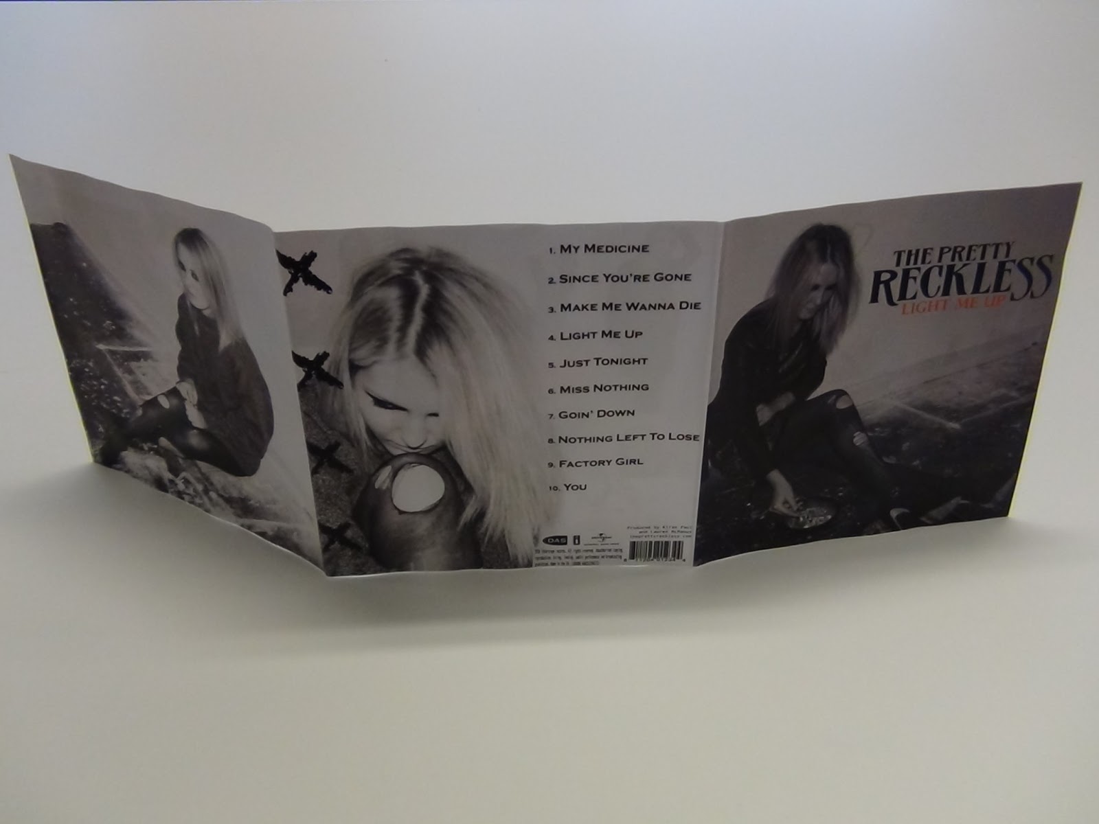
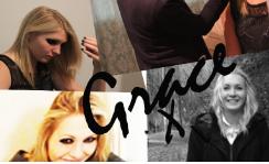
The three images above is the inside cover for the album.
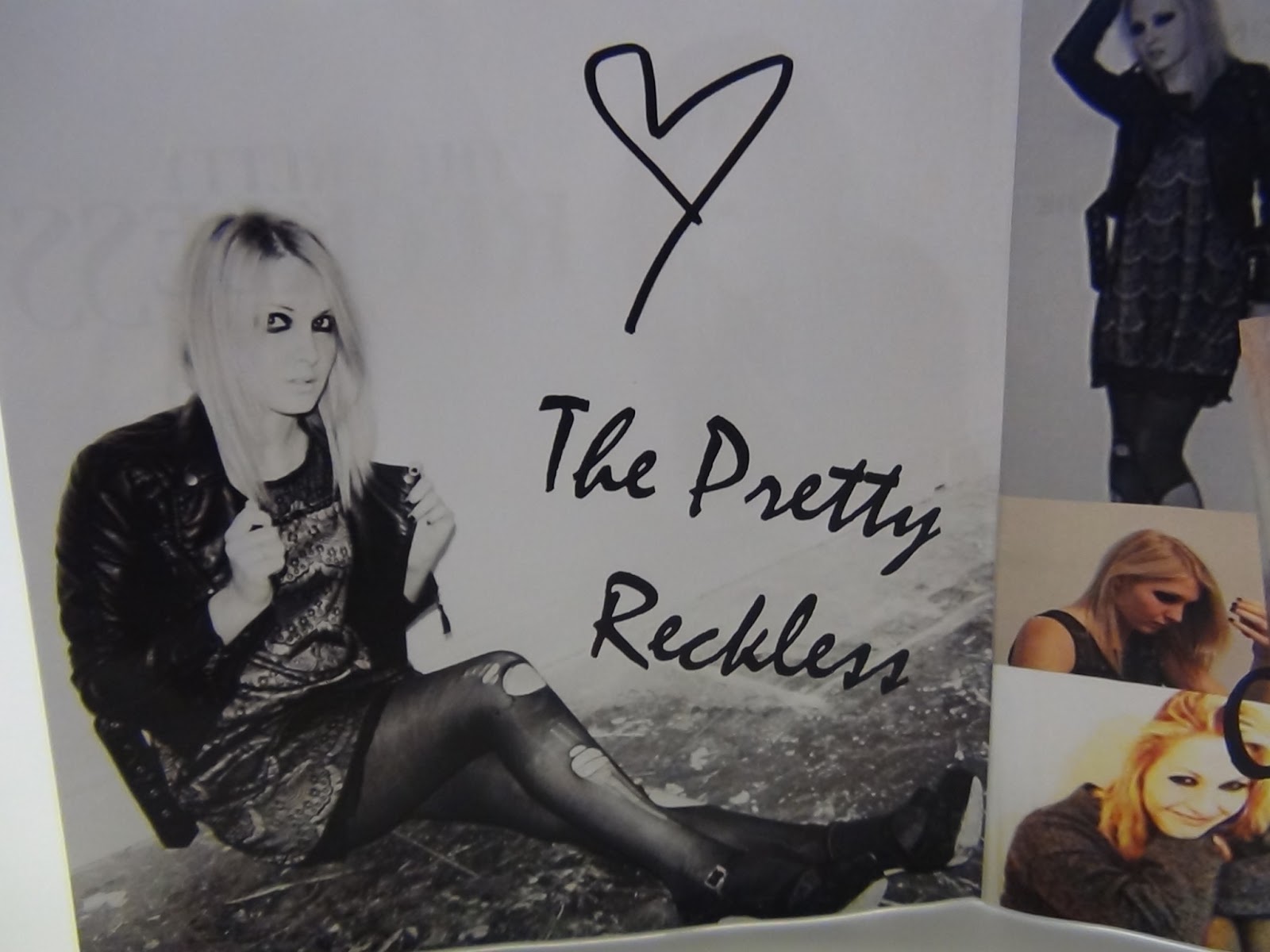
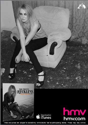
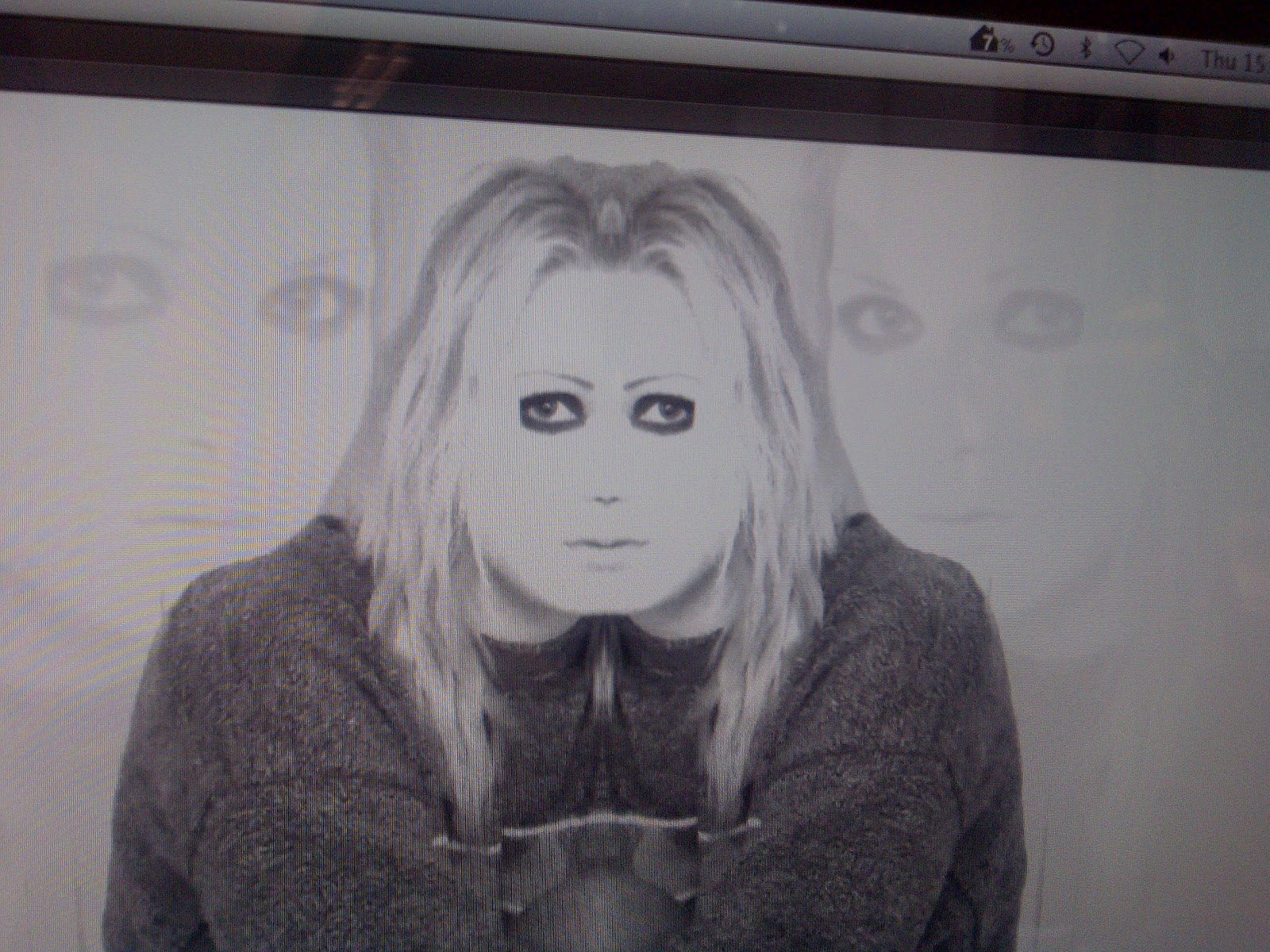
This image is the inside main cover and will cover up one side of the album. We have typed the band name and drew a heart to emphaise the personal feel of the album. This feature has been done in many album covers of all genres as it depends on the individual's perspective. The brightness and contrast has also been altered to 81% and 88% to get the sharp white background and the darkness of the Grace's outline.
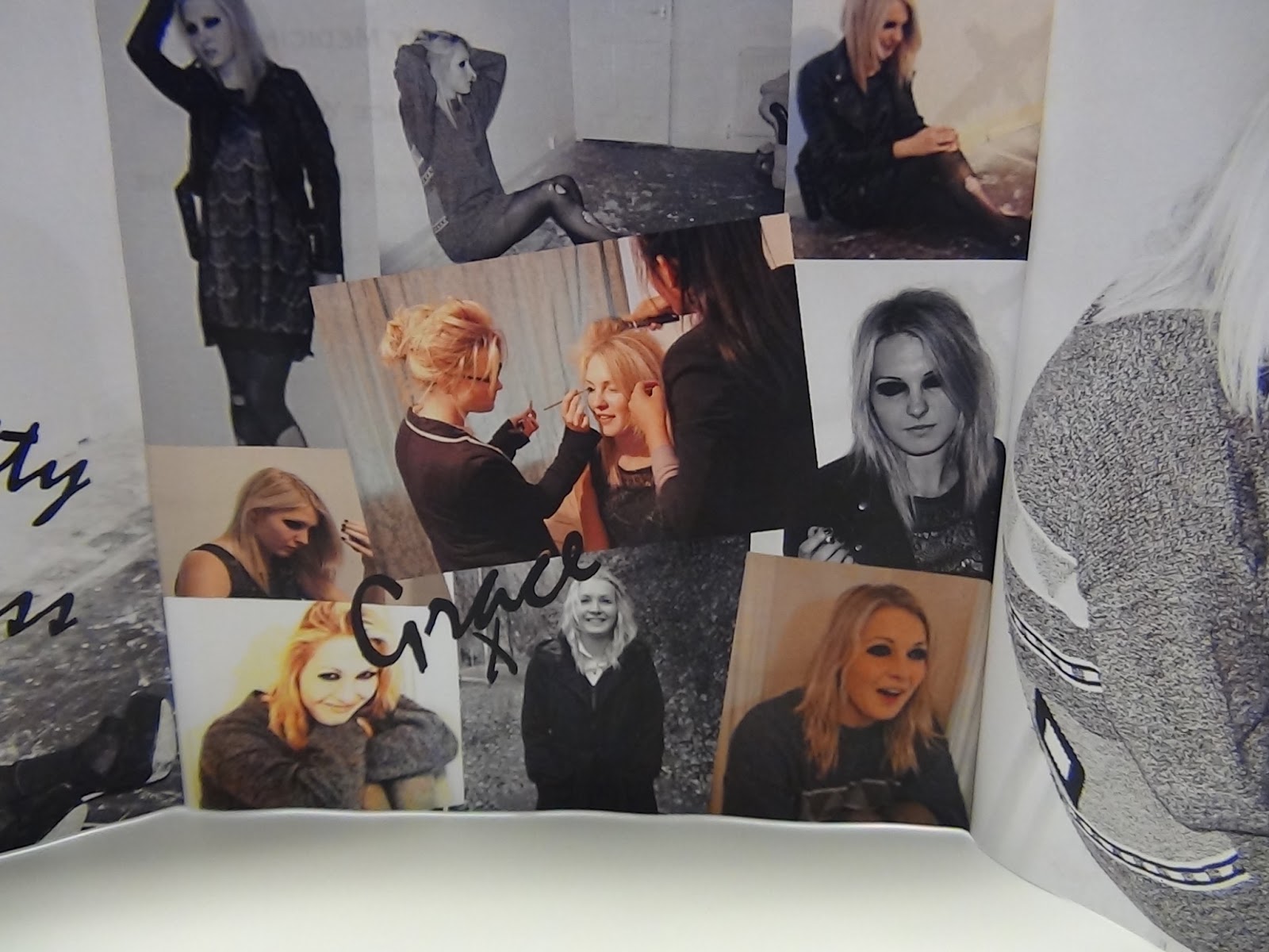
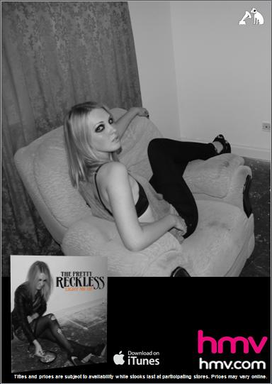
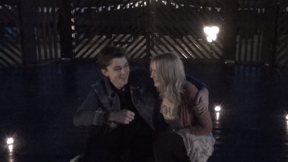
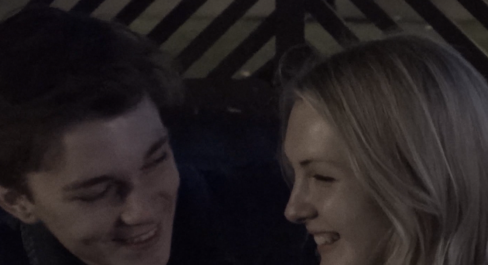
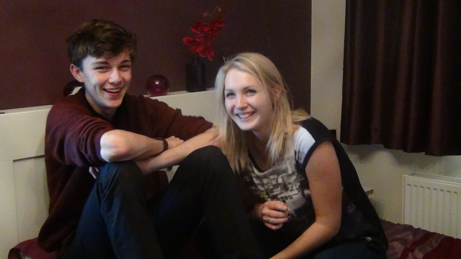
The middle image is a collage of pictures of Grace at different shots and candids. We wanted a personal feel so placed fun images that were taken during the photo-shoot and filming. We did not want serious ones as we felt it would not be as fun and would not add to the personal feel.
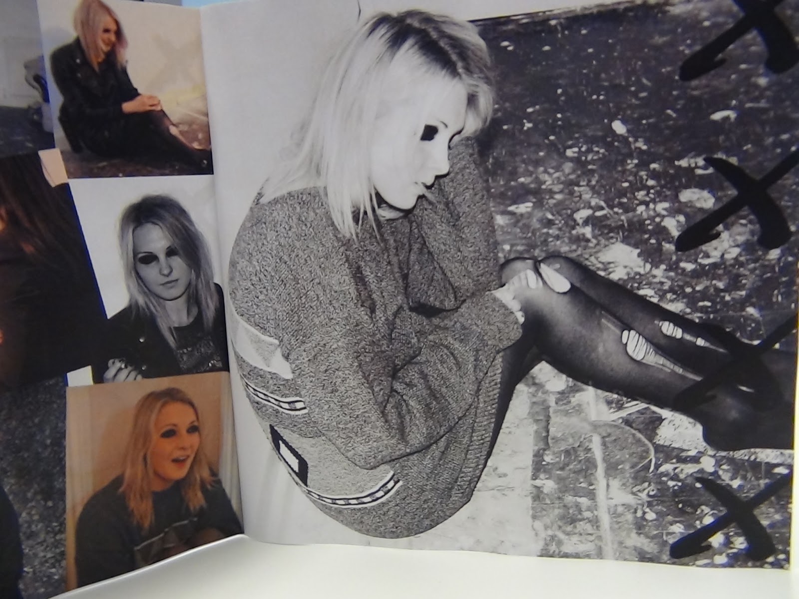
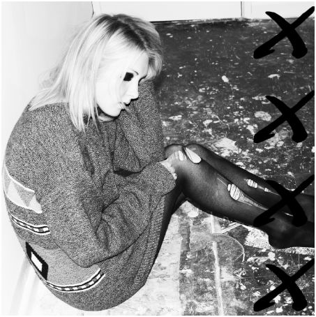
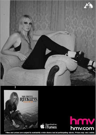
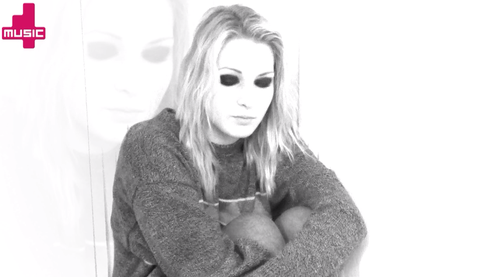
 This image is the final image of the inside cover, it is also black and white and the brightness and contrast was changed to look consistent. The same four x's as used on the back cover we also used in this bit however the font has changed to a marker pen to imply it was done by Grace. This logo is their signature icon and is used on all the advertisements so we felt if we incorporated it into the inside cover as well as back it would promote them.
Author: Kiran Paul and Lauren Mcmanus


